In spring it was announced that Flickr was going to be acquired by SmugMug. After many years frustration about Flickr's direction and ownership, I'm convinced this is the best Flickr news in something like a decade or so...
Under Yahoo/Verizon/Oath, Flickr was in my eyes turned into some skizofren combination of a cloud backup service and a wannabe instagram competitor. The site became less-and-less gallery like, and great features for exploring other peoples backlogs of photos was crippled or removed.
But SmugMug is a company controlled by photographers, and I expect they will lead Flickr in a new direction much more focused on presenting photo collections in a nice way and improve the community experience and exploration features. SmugMug has already tweeted a couple of statements from CEO Don MacAskill that backs my optimism:
"Flickr isn't Instagram and, under my watch, it won't ever be. Flickr is all about a long-lasting, deep, abiding photographer community."
"Flickr is not about showing a photo to quickly gather some likes & comments today, only to never have that photo be seen again. It's about engaging in visual storytelling that lasts forever."
Notice, this Rockland posting is very much based on a series of comments I made in a wishlist thread in the Flickr Help Forum. Thus it is in English and some parts of it might sound a bit repetitive/redundant (I'll try to fix the most redundant parts down the road).
The Best Thing about Flickr!
Before looking at my big long wish-list, a look at what I think Flickr has done absolutely right. In my eyes, it's how you can organize your photos...
The "photostream"
You have a stream of photos ordered like a (b)log or social feed. This shows your photos with your latest additions/uploads first. Just like a blog (There's a stupid option to override the order in the photostream, I choose to overlook it. It's just adding confusion to the concept).
The Albums (and Collections)
You can add a photo to any number of albums you want to, and you can put the photos in any order you like in your albums. These are you're "themed galleries".
The photos
There is only ONE of each photo even though it can be present in multiple albums (or none). Each photo has it's assigned "attributes", which follows the photo no matter if you see it in the photostream or in one of the albums it has been added to. By "attributes" I mean things like title, description, faves, comments, privacy & safety level settings, tags, etc.
So the smart thing is?... Well, you can organize, and re-organize, and re-organize even more and again. Remove a photo from two albums and add it to three other albums. Comments, faves, privacy-level and everything else follows the individual photos no matter how you organize and reorganize your albums. You can have an album mixed of public and friends-only photos. The friends can see all the photos in the album, while others only see the public ones.
It's simple, it's smart. It is implemented soo right that it almost hurts!
I have had a major crisis with Flickr in many years following a move Flickr did in 2012, and for years I was looking for another competent photo-community offering similar flexibility in organizing my photos. But I never found it, so I'm still on Flickr. It's Flickr's biggest asset competing with other photo-communities, and Flickr should be aware of it and take advantage of it. They don't do it in current design, but I'll get back to that...
Presentation of my photos
My largest frustrations with current Flickr design is in relation to the presentation of my photos. Thus some of my highest wishes for future Flickr goes towards fixing that.
Photostream design
Current photostream design doesn't work at all for me. The messy flow of photos does not give the photos the presentation I want. It is impossible for me to look at current layout and call it my photo-gallery or anything else flattering. One photo per line in my photo-column should be the normal. At least for 1st page with latest additions. I might accept a compromise on page 2 and forward...
Also with one photo per line in the photo-column, there should be room for at least the first couple of lines of each photo's description . If so, I would actually be able to point to my photostream and call it "my photo-blog"!
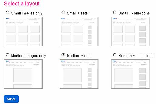
I intentionally wrote one photo per line in the photo-column. Because I would like a smaller second column teasing some of my albums. With the album column I would really be able to point at my photostream and name it "my photo gallery" ! And Flickr should really give albums the visibility they deserves, because as mentioned above, I think it's flickr's biggest asset. Currently albums are hidden in a top-menu no casual visitor ever sees or opens, and it is sadly visible in view statics on albums. Nobody ever look at albums anymore! :-(
Conceptually, what I want was available earlier, when Flickr offered you to choose between several photostream designs. The photostream concept I liked, and a popular option in general as I remember, is the selected one here (sets=albums):
Make all my photos available in the big display sizes
Up until 2012 Flickr had always updated the full database of photos when new browsing-sizes was introduced on the site. However in May 2012 only photos uploaded after March 2012 was updated when Flickr introduced 1600px and 2048px wide browsing-sizes, leaving the majority of photos to be displayed only 1024px wide, even on 24+ inch monitors. Please SmugMug, make my pre-2012 uploads available in 1600px and 2048px display versions like the rest of my photos. It could eventually be a Pro-only service?. Hell, it could even be a pay-once service to update your collection? I'll pretty much pay anything to get the first 7 years of my photo collection updated to the display sizes you need on today's desktop monitors.
Navigating my photos
Make navigation more flexible. Why do you for example have to start from the top of an album? This leads me straight to another major subject I want to talk about...
Make Flickr EXPLORATION-friendly (again) !
This one is more a "theme" than a single feature. Flickr have lost a lot its "exploarability" during the years, and it's really sad for the dynamic and diversity of the site. Flickr introduced Explore-page, but when that's where everybody goes for inspiration, then it doesn't help much that Flickr tries to make the algorithm behind more "explorable", everybody still sees the same photos and photographers. Flickr looses it's dynamic and diversity this way.
Besides using Flickr as a place to exhibit my photos, Flickr is also a place to explore other peoples photos and discover new photographers. And once it was a very good place to do that...
When Flickr was best, it was a fantastic place to explore photos and discover interesting subjects and new photographers. But today Flickr has lost the best exploration features, and instead of being a very dynamic and diverse place, Flickr has become very "one-dimensional".
There was especially three features of Flickr that once supported and seduced you to do deep exploration in Flickr's treasure chest:
- Albums displayed on Photostream pages
Besides digging into a photographer's photos from page 1 in the photostream, you where via displayed albums invited to attack the collection by other angles independent of when it was uploaded. Today people normally only look at the photos found on first page of a photographer's photostream, a few might continue to page 2, but "nobody" ever sees anything beyond that. - Flickr Map
Flickr Map was really good in it's first years. REEEAALY GOOD. I used it a lot. Often as a tool to scout an area before visiting it, other times solely for exploration by digging down into some random area. Sometimes the first also seduced me to explore new photographers and forget about my original reason to be there. But something has changed with Flickr Map. It has become seriously crippled and I rarely use it anymore. Most of all it seems only a very little fraction of Flickr's photos are discoverable when doing a general search in an area. Often when I zoom into an area where I know there should be a lots of geotagged photos, Flickr Map is completely empty. But there's also a lot of other problems with Flickr Map today making it almost practically useless. Okay if not completely useless, then definitely frustrating and not very inviting for exploration. Even if I just want to see the location a photo was shot, I prefer using a hack to see it on Google Maps instead. - "Context strips" or "Filmstrips" (navigation widget)
There must have been genius behind the design of this little navigation widget and concept, which as far as I remember was already a part of Flickr when I joined in 2005. But it was lost in the latest big re-design of Flickr. I don't remember if it had an official name, but I've seen it mentioned as "Context strips" and "Filmstrips". The strips was "sneak previews" of next and previous photos in albums, groups and photostream a photo was posted in, directly on the photopage. As Flickr user FlyButtafly so beautiful describes the "strips":Those wonderful, expandable/collapsible thumbnails that showed which groups/albums/photostreams they were in, were easily-scrollable, and provided a quick way to go to hop-skip-jumping around the flickrverse, exploring to your heart's content! You could even open up an album or photostream in the exact spot where that photo resided, instead of having to do a url hack or go digging to find it.
As I said, it was work of a genius, and it could transfer you deep into "forgotten" and rarely visited places in groups, albums and photostreams.
The best thing about these three "exploration tools" is that they supported individual exploration. Everyone using them inevitably ended up in completely different places discovering different photos and photographers. And the next time you went exploring, you would also end up a completely different place than the previous time. That's very different from how exploration generally works on Flickr today. Everyone only sees first page of photostreams, first page of group pools, and the same Explore page as everyone else sees that day. All ending with we all see and fave the same photos and follows the same photographers. And everything is always only about the very latest uploads. That's how Flickr have lost the dynamic and diversity it used to have, the "thing" I believe made Flickr so big and successful in it's first years. Flickr in its early years was such a fun place to be inspired, amused, or just kill some time while having fun.
As I see it, Flickr has done some attempts to bring more "explorability" back to Flickr. Most notably the Trending pages which at first sounded interesting. But in my opinion, they failed. The Trending pages seems to be circling around the same very generic themes again and again, rarely catching anything that really looks like a "trend" (And if you dive into one of the "trend pages" it is not just new uploads it shows. So what is the "trend"?). If they were really able to not just catch a trend, but catch a "local trend" like last weeks music festival or air show, or maybe yesterdays extraordinary nice double rainbow over the city, then it would probably really start to get interesting. But even though Flickr is still relatively big, I don't imagine there's data enough to make that possible (especially if most uploads are automatic backups without tags or descriptions)?
But also, while making a feature like Explore (or Trends) controlled by clever algorithms must have been fun for developers and engineers, in the end the tools which supports individuals to go their own ways, controlled by their own minds, is the best, most fun and most giving way to explore.
The very big list of wishes...
Okay, let's dig into it. Big and small things. Some already mentioned in more details above...The presentation of our photos
- Landing page (photostream frontpage): Change layout for nicer presentation of each photo and make room for featured albums - or give us multiple layout options!
- Give our pre-2012 uploads big display sizes like the later uploads.
I've been told by insider, that all display versions of photos are going to be recreated when moving photos to SmugMugs cloudservers, and in this proces the 1600px and 2048px wide display sizes is most likely also going to be created for uploads pre-dating 2012.
Exploration
- Albums displayed on photostream pages (I know, I'm repeating myself a lot here) as another angle to attack a photo-collections.
- Make all geotagged photos generaly searchable on Flickr Map. Today Flickr Map seems broken in several ways, but most annoyingly the amount of photos discoverable by general search, seems only to be a tiny little fraction of what should be discoverable. It use to be a fun tool for random exploration a big selection of photos to search. But it's not of much use/joy in its current form.
- Navigation tool to go deep exploring. Something like context strips / film strips we once had?
Other miscellaneous stuff
Flickr, the World, and how color spaces are handled today...
In early 2018 I did some investigation on how color spaces is handled on Flickr and the internet today. First and most important:
Flickr keeps IIC color profile (color space) information in all display versions (At least when defined saving with my Photoshop CC). It doesn't seem Flickr tries to convert them to sRGB, just keeps them with the color space it was uploaded with. That's also how I think it should be! :-)
So it's up to the clients if photos using "alternative" (non-sRGB) color profiles are correctly displayed.
I continued looking at desktop browsers, and it's also good news. All current desktop web-browsers supports color profiles: Chrome, Firefox, Opera, MS Edge(*), yes even Internet Explorer 11. I tested with sRGB, Adobe RGB, DCI-P3 and ProPhoto RGB.
Continuing to mobile devices, things unfortunately gets more complicated. I don't own any Apple devices myself, but as far as I know there have been pretty good color managing in several years. So I don't think Apple/IOS devices are much of a problem(?)
Unfortunately the standard Android system hasn't got official color management until version 8 Oreo, and even then (most?(**)) apps still has to be updated to support it!
I did some testing on my Google Pixel. Of course Google's own Android Chrome browser supports it. And so do FlickrFolio, a third-party Flickr app. But unfortunately Flickr's own app doesn't yet support it and shows photos with wide gamut color spaces with "washed-out colors". Firefox for Android doesn't yet support it either :-/
So in conclusion, the desktop world is ready, but unfortunately mobile world is still behind, and it's a segment that is hard to ignore these days:-/ ...
So for now I'm still converting my photos to sRGB before uploading to Flickr. But I'm eagerly waiting for the day when most Android devices are on version 8+, and Flickr's own app plus popular mobile browsers all supports proper color management.
I've been told, that all display versions of photos are going to be re-created when Flickr moves the photos to SmugMug's cloud-servers. Hopefully they don't change their current practice of preserving color space when that happens.
(*) There's a caveat with Microsoft browsers. While they do understand and handle color profiles in photos correctly, the browsers are currently not aware of your hardware's profile. So if you have a wide-gamut monitor on your Windows PC, colors are shown over-saturated with Microsoft browsers, no matter which profile photos are saved with. So in short, if you have a wide-gamut monitor, don't use Microsofts own web-browsers :-/ ...
(**) I think maybe Android webview based apps automatically supports it, but not sure?
- Get rid of the Yahoo login. It's a no-brainer. Probably didn't have to write it. I assume it will happen...
Unsurprisingly it has more or less officially been announced, that it will happen. And it will be the first big change they make. Developers are problably working hard right now to get rid of all technical ties to Yahoo. I'm eagerly looking forward to being able to close my Yahoo account :-) - Make my pages friendly for the non-Flickr users visiting. Right now they get a very annoying pop-up trying to encourage them to sign up, every time they go to a new page in my photostream (or album?). Problem is that it is so offensive I cannot think anything, but it scares my visitors (which also could be potential future Flickr users!) away forever. And I'm even a Flickr Pro user, paying to have my photos shown without any adds. But that's clearly an ad in my eyes, and even a very annoying one!
Problem solved! In beginning of October, Flickr finaly choose to remove the annoying popup. - Improve group and community features. There's so many things that can be done here, and good place to invest for more life on Flickr.
- Improve Flickr Map. Besides making all photos that should be discoverable, actual discoverable on Flickr Map, update it to use Google Maps. Not only because Google's maps and satellite photos generally are better than Yahoo's, but if Flickr Map also integrated with personal Google Maps features like for example favorite locations (making it possible to see your existing Google Maps favorite locations directly on Flickr Map - and add new ones!), then it would really be cool and useful in new ways.
- On photopages for geotagged photos, make it possible to see exactly where the geo-location is when clicking on the map-widget.
- When Albums (hopefully) are brought back from its current secret life, also return album-comments, album-map and an album-layout that works for album-descriptions longer than one and a half line. I have some album descriptions that are complete travel descriptions!
- Top-pagers, so you don't have to scroll to the bottom of a page for pagination (photostreams, albums, group pools, etc.). At least as long as pages are working/looking like today.
- I know, for some it's a bit controversial, but: Even harder restrictions on how many groups you can post photos to. The group pools are ruined by people spamming their photos to all possible groups they can without respecting the group rules and themes.
- Make it obligatory to set content-type on non-photos again, so it's possible for people not interested in those 3D-renderings and game screenshots to avoid them. Or groups to disallow them.
- Keep exif copyright info in all display sizes generated (for a short period it actually happened, but feature was quickly lost again).
- Adjustable slideshow speed. The current is much too fast for me. I get stressed and doesn't get the time to enjoy and "digest" a photo. Btw, in old days you could make pretty much any list of photos (including a search result) into a slideshow by appending a "/show" to the url. I think you still can do that, but only on PCs with Flash installed. Please also make the new non-Flash slideshow available on the "/show" adresses.
- Color management/profile support in the Flickr app on Android 8+. See feature-box.
- Get rid of Flickr-ideas on Yahoo's uservoice site. It sucks. Instead re-introduce a forum for inspirational discussions like we once had (yes, there will be trolls too, I know :-/). I think it was called FlickrDiscuss. It could eventually be supplemented with a (better) public bug-tracker system. But there should definitely be a place for community members to discuss and develop features, ideas and wishes for Flickr (We are normally not allowed to do that in the Help-forum, and uservoice are definitely NOT a good place for discussions).
No direct replacement for the uservoice site has been found, but the site has actually been closed and previous links to it now points to a contact formular instead. - Flickr App Garden. What happened? It's still there if you can find it, but seriously broken. Search has been broken in years (Have never been able to find an "app" I added 2 1/2 year ago via search the functionality). Comments and faves are gone, and when I recently wanted to replace or add another screenshot to my app, I couldn't find the option to it anymore? Flickr API are an interesting part of Flickr even though we don't see as many "mashups" as we did years back. But Flickr could help bringing a bit more life to this by focusing more on what happens in this Flickr-world and fix or replace that App Garden with something that works.
- It's easy to forget in a single-page webapplication, but everything should have a link/webadress!. This means:
- You can bookmark the page
- You can link to the page
- You can open the page in a new browser tab or window via ctrl or right-clicking a link (and Flickr should use the link on navigation elements - at least as a fallback when click-event is not captured, like when right- or ctrl-clicking)
- Okay, this one's big, but make Flickr design more consistent. Currently it's a mix of several generations of Flickr. Also consider making a clear visual distinction between public pages and your private account pages. For example the header on the Camera Roll page might confuse some people to think it's a public view of your gallery other people have access to too.
For many people photography today is about showing what you are doing or eating right now on social network. It seems that Yahoo have tried to adapt Flickr to support this kind of users. But it makes no sence to try to change a site that bottom-up was designed for something else. If you want to compete with Facebook, Instagram, Snapchat or whatever, you need a good concept built bottom-up for that. Flickr should take advantage of the fundament it is build on. While not everyone is interested in organising your photos in albums and creating a "gallery", we are still a lot of photographers that want to do that. Focus on that instead of trying to make Flickr into something it doesn't have a change to succeed with anyway.
But it actually sounds like SmugMug and I very much share the same opinions on what Flickr should be and evolve. So I'm pretty optimistic about the future of my photo gallery :-)
![[Rockland hand logo]](/animhand-c8t.gif)
![Vandfald ved Lake Canaima [Foto: Vandfald ved Lake Canaima]](/img/canaima1-1380x838.jpg)
![Vandfald ved Lake Canaima [Foto: Vandfald ved Lake Canaima]](/img/canaima2-1380x806.jpg)
![Både i Lake Canaima [Foto: Både i Lake Canaima]](/img/canaima3-1380x920.jpg)
![Palmer i vandkanten af Lake Canaima [Foto: Palmer i vandkanten af Lake Canaima]](/img/canaima4-1380x776.jpg)
![Lake Canaima fra luften [Foto: Lake Canaima fra luften]](/img/canaima5-1380x920.jpg)
![Canaima fra luften [Foto: Canaima fra luften]](/img/canaima6-1380x920.jpg)
![Canaima fra luften [Foto: Canaima fra luften]](/img/canaima7-1380x920.jpg)
![Drenge laver opvisning [Foto: Drenge laver opvisning]](/img/klippespringer-1380x1927.jpg)


![Stig's Last.fm Album Linkr [screenshot]](/img/lastfmalbumlinkrfeatures-900x798.png)
![En kolonne featuring 10 af fotografens albums tilføjes ved siden a photostreams [screenshot 1]](/img/Albums725.jpg)
![Effekten på min 24 tommer 1920x1200 pixels monitor [screenshot 2]](/img/Browser-scale-870.jpg)
![Tags får en ekstra feature: Find andre taggede fotos fra samme fotograf [screenshot 3]](/img/Tags725.jpg)
